Tuesday, April 26, 2016

Week 16--Architecture

Probably shape and repetition are the two most important principles of design expressed in this photo. First and foremost, the shapes of the twin buildings take up most of the foreground compositionally. That, added to their staggered placement on either side of the photograph, demand the majority of the viewer's attention. Secondly, repetition is woven throughout the photograph in an attempt to unify the piece. Repetition exists primarily in the rectangular-shaped windows that are interspersed throughout the two buildings. 

Though the building is a static subject--it doesn't move at all, or lend any suggestion of movement to the photograph--the cables overhead help to add a sense of movement to the piece. The viewer's eye can trace the cables from the top right corner, dipping down slightly below the top left corner. Repetition and contrast likewise play important roles in creating an aesthetically pleasing photograph. While the repetition of the pillars and bricks on the building help to draw the composition together, the contrast of the green trees and blue sky create just enough variety so the subjects don't completely blend together. 

This is a picture of the same building as in the photograph above, however I took it at a different angle in order to emphasize the shadows and overall tonal value of the pillars. I really liked how the shadows and highlights imparted a three-dimension quality upon the subject; transforming it from a series of two-dimensional square and rectangular shapes. I purposefully took the picture so half of the building was cut off, creating a slightly unbalanced effect in the composition. 

Tuesday, April 19, 2016

Week 15--Macro Photography

I had taken this macro photo in the studio, using the light tent in order to diffuse the light. The combination of the light tent, as well as the strobe flashes enabled me to capture the highlights as well as the shadows of the metal keychain. Then in Photoshop, I increased the image contrast, the levels, and I decreased the vibrance in order to emphasize the texture of the key. 

Also utilizing the light tent and strobe flashes, I tried to experiment with the shutter speed in this photograph in order to achieve an interesting depth of field. In addition, I varied the focus on the image; making it so only one portion of the subject was in focus. Having the other portion of the subject blurry helped give the subject a three-dimensional quality. Again, in photoshop I increased the contrast, decreased the color value and saturation, and increased the levels. 

I liked the contrast inherent in this photograph; specifically the light key on the right side of the photograph, contrasted against the darker key on the left side of the photograph. Also, the composition of the photograph (having one key on each side of the photograph) helps the viewer's eye to travel through the lines of the subject. Furthermore, having the subjects placed so that one part appeared out of focus ( the topmost ring) helped to make the photograph visually pleasing to the viewer's eye. 

Thursday, April 14, 2016

EOC Preparation Quizzes


Week 14--Night

Color is most definitely the most important concept presented in this photograph. And because of the darkness of the background, the brilliant neon color of the sign is emphasized so it pops out at the viewer. Because of the tilt of the camera, the picture seems to be split in two hemispheres; the top and bottom. The sign and additional neon lights help move the viewer's eye through the photograph. 

Tonal value is the key element in this photograph. Specifically, the tonal value of the church; the deep shadows, middle tones, and the whiter highlights all work together to make the church appear three-dimensional. When I had taken the photo initially, the aperture and shutter speed settings had been off. So in photoshop, I increased the contrast in order to make the photograph appear less blurry. 

I liked how the concept of line was represented in the composition of this photograph. There appear to be several different types of line; horizontal, diagonal, vertical, and a few radial lines as well. The horizontal and diagonal lines set the boundary for the composition; they mark the very edge of the building. The vertical lines are embodied in the row of hanging chile ristras, and last but not least the radial lines spread out just above the lamp. Overall, the lines create unity in the piece--drawing the different parts of the photograph together--and they help the viewer's eye move through the photograph. 

Saturday, March 26, 2016

Week 13--Physical Activity

I liked how the blue tones in the photograph served to unify the image. For example, the blue metal of the swing sets, the light blue sky, and the blue roofs in the distance. Likewise, line is an important concept in the image, because the viewer's eye travels down the chain of the swing, and then angles downward. Instead of purposefully blurring the photograph in order to illustrate motion, I chose to follow the path of the swing so the girl appears to be frozen in midair. 

When I had initially taken the photo, there had been so much lens flare, overexposure, and motion blur that it had been difficult to make out the actual subject. So using Photoshop, I increased the contrast of the photograph so that the lens flare disappeared and the subject was clearly visible. Compositionally, I believe that shape is the most important concept in the photograph; the yellow circular handle, the girl's face, and her arms. 


Contrast really seems to make this photograph more interesting to the viewer, at least in regard to color. The yellow, white, and blue volleyball stands out sharply against the green foliage of the trees, as does the white net and the man's shirt. Likewise, the repetition square shapes made by the net serve to separate the photograph into halves, making it more aesthetically pleasing to the viewer. 

Wednesday, March 23, 2016

Week 12--Real Birds

I thought that pattern was the most important artistic principle employed in this photograph; the rippled pattern of the water, and the dotted pattern on the duck's breast. Contrast would be a close second, though. The stark difference between the water and the duck's beak definitely draws the viewer's eye directly to the beak. Likewise, the contrast of the duck's black and white feathers let the viewer's eye roam through the photograph, beginning at the duck's head and ending at its tail. 

I liked the unity of this photograph; it seems to be woven together because of the repeated orange, pink, white, red color of the flamingos. Repetition plays a large part in the unity of the piece, and not just color-wise; the repetition of the legs, necks, beaks, and feathers makes the photograph appear whole. At the same time, however, there is a contrast in the photograph; the one flamingo in the center fluffing its feathers up. In my opinion, both the unity and the contrast make the photograph aesthetically pleasing. 

Overall, I think that texture played a large role in this particular photograph. Two major examples of texture include the texture of the ground and the texture of the peacocks' tail. The ground serves as negative space in the photograph, but the texture of the rocks and dirt also contrast against the sleek feathers on the peacocks neck. Lastly, the colors of the peacocks feathers stood out beautifully against the background, and I chose to accentuate that contrast slightly by increasing the saturation in photoshop. 

Tuesday, March 15, 2016

Week 11--Concept of Light

I had taken this photo in Williams, Arizona. I didn't have a tripod, so the original photo was slightly shaky. On my camera, I had adjusted the aperture to let in as much light as possible, and I decreased the shutter speed in order to get the right exposure. Then in photoshop, I increased the levels in order to eliminate the light flare from the neon sign. Additionally, I cropped the photo so the neon sign was placed slightly to the left-hand side of the photograph. 

Christmas eve in Old Town plaza; again, no tripod so the original image was slightly shaky. Using the manual settings on my camera, I decreased the aperture and the shutter speed in order to correctly expose the girl. I didn't want to use a flash, because then the twinkle lights would appear faded and washed out. In photoshop, I shifted the color balance slightly toward cyan. Overall, the image appears unified because of the whitish yellow lights in the background.   

I tried taking a photo of a firework exploding on the 4th of July, and the end result was not at all what I expected. My camera had a specific option for fireworks, so I'm exactly sure what settings it incorporated. Probably line and color are the most obvious principles of this photo; the radial lines made by the explosion, and the different colors included within. 

Monday, March 14, 2016

EOC Preparation Quiz

On the first quiz, I learned that the speed of a lens refers to the maximum diameter of its aperture (or the minimum f-stop number) of a camera lens. I also learned that flash sync refers to synchronizing the flash of a camera with the subsequent opening of its shutter to allow light in. I don't know how many questions I got right, but I received a "pro" rating on the quiz. 

On the second quiz, I learned that shutter speed can be used not only to create a pleasing blur in the photograph, but also to help correctly expose a dark area. I also learned that the f-stop is the ratio between the aperture and the focal length of the lens; so a longer lens needs a wider opening to achieve the same ratio. On the second quiz, I answered 18 out of 22 questions correctly. 

Tuesday, March 8, 2016

Week 10--Lonely Tree

I had taken this photo with a setting specifically for sunsets; with a larger aperture and a slower shutter speed. I didn't use a tripod, but I tried to hold the camera as steady as I possibly could. In photoshop, I increased the brightness of the picture and played around with the contrast. I loved the purple, blue and red color of the photograph, and in order to bring that out I increased the vibrancy. 

I liked the perspective of this photograph; I had taken it looking directly up at the tree, with my phone camera resting on the trunk of the tree. I loved the radial quality of the lines that branched out from the trunk like spokes on a wheel. In photoshop, I increased the contrast, decreased the contrast, and played around with the vibrance of the leaves and sky. 

I had purposefully placed the tree in the far left corner in order to emphasize the isolation of said tree; it was surrounded by mountains, clouds, and sky. Furthermore, the photograph followed the rule of thirds and made the picture compositionally more interesting. Using photoshop, I increased the levels to give the background a deeper saturation. I also played with the vibrance, contrast, and brightness to make the photo pop with color.   

Monday, March 7, 2016

David Hockney Photography

David Hockney was born in Bradford, England on July 9th, 1937. He is a wonderful painter and photographer; famous for his photo collages and paintings of Los Angels swimming pools.

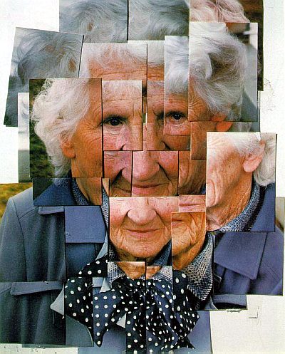
Hockney's first photo collage emerged in the early '70s while he was painting the interior of a Los Angels home. In order to accurately paint the living room, Hockney had taken a series of photographs from different angles. Hockney later assembled the Polaroid photos together in a grid-like fashion. Even though he taken the photos purely as reference material, Hockney realized the photo collage (or "joiner", as he later nicknamed the photo collage) could stand alone as its own form of art.

He pursued this art form more in depth during the mid to late '70s, taking hundreds of photos from varying angles and assembling them into a single collage.

This is a well-known photo collage that Hockney composed, depicting his elderly mother.

Hockney explored his fascination with the Los Angels swimming pools through a different medium, assembling several collages where the swimming pool was the subject.

Hundreds of photos must have been taken in order to create such a large, detailed collage. 

The fact that Hockney took photos from multiple angles adds a surreal quality to his photographs, as he depicts everyday objects in new, fascinating ways. 

The perspective of this collage is interesting; Hockney is able to capture his elderly mother sitting in a graveyard, in addition to his own feet in the photograph.

At first glance Hockney's self portrait might seem disjointed, but in actuality he was able to layer the images quite well.  

With the use of the photo collage, Hockney achieves almost a panoramic view of his subject matter.

Hockney's photos blend together seamlessly because he included a small section of the subject in every consecutive photo he took.

Hockney's style of illustrating multiple emotions and positions for each of his subjects is unique and unparalleled.  

Layering the Polaroids in such a fashion creates movement in Hockney's collages that wouldn't otherwise exist; certainly not in the original pictures. 


Wednesday, March 2, 2016

Week 9--People Hard at Work

Yesterday I discovered a timer app on my phone, enabling me to take photos without having to press the shutter button. Using this app, I took several photos of myself preparing food in my kitchen. In photoshop, I applied the oil paint filter. I loved how the oil paint filter smoothed the transitions from the warmer tones of the kitchen background  to the cooler blues of my shirt and the red bowl. I feel that the picture was further unified by the repetition of color; the white of my shirt and of the refrigerator, and the red of the bowl and the toaster in the background. 

To get this particular angle, I stood up on a chair and sort of leaned in toward the subject. In photoshop, I chose not to use the oil filter for this particular photo because I liked the texture of the wood grain and of the gray beanie. However, I did increase the overall contrast and vibrance. It's almost as if the curving lines of her arms serve as reference points for the viewer's eye to travel through the photo. 

Again, I applied the oil paint filter to this photograph in photoshop. I thought the photo looked rather bland, and needed the additional texture. Although the composition seems chaotic, the contrast of the pale blue computer screen against the tan wall serves as a reference point. Likewise, the bright green Sprite container, and the girl's red wristband contrasted against the background help to draw the viewer's eye in a circular motion from the center outward.  

Monday, February 22, 2016

Week 8--Mechanical Terrestrial Transport

Earlier in the year I had taken a picture of one of the little carts that the school groundskeepers used. And I was looking through my photos and realized the little cart perfectly fit this weeks blog assignment. In photoshop, I increased the brightness of the photo so the cart wasn't shrouded in shadow. I also played around with the overall color balance, and increased the vibrance of the tree foliage. 
Behind the PAC, some of the APS transport trucks are kept behind chain-link fences. In this photo, I liked how the poles of the fence split up the composition into smaller quadrants, and also added a bonus texture to the truck. The colors were also appealing; the bright yellowish green of the grass and flowers against the cool whitish blue color of the sky overhead. When editing this image in photoshop, I increased the brightness, increased the contrast, played with the color balance, and increased the color vibrancy. 

I really love the lines and shapes captured in the subject of this photograph. The spokes of the bikes' rear wheel, the circles in the fence, and the links of the chain all create interesting patterns for the viewer's eye to follow throughout the piece. I purposefully increased the contrast and brightness in photoshop so the bike would stand out against the lighter background. Also, I decreased the vibrancy and saturation so that the photo appeared almost black and white, but still with a slightly blue tint around the lock and individual chain links. 

Wednesday, February 17, 2016

Week7--Personifying an inanimate object

To personify the dish scrubbers, I decided to draw faces on them with tape and purple Sharpie marker. This photograph was set up in my kitchen, using the overhead stove lights for the light source. In photoshop, I cropped the bottom of the image slightly and adjusted the overall contrast. 

Using the same tape and purple Sharpie technique, I drew faces on a few roses sitting in a nearby vase. Mostly, I chose to focus on the expressions of each "face". That was the best way I could think of to personify inanimate objects. Using photoshop, I adjusted the tonal value of the piece, and increased the vibrance so the roses looked more colorful. 

I had taken this photo on my phone, so the color balance of the raw photograph was simply awful. Luckily I fixed that in photoshop, by decreasing the amount of magenta and conversely increasing the amount of cyan. With the clone stamp tool, I tried to conceal the obvious tape lines so they wouldn't be distracting to the viewer. Similar to the other flower photo, I likewise increased the saturation and the contrast of the piece. 

Monday, February 8, 2016

Week 6--Performing Arts


In this photograph, I tried to focus on the color scheme. The majority of the colors are close to each other on the color wheel; cool blues, grays, and whites. The use of analogous colors helps to tie together the photograph, unifying it more than if a different color scheme were employed.  Furthermore, I utilized the rule of thirds in composition to balance between the subject, foreground, and background. 


Emphasis was the principle of design I wanted to focus on in this photograph. Although instead of drawing the viewer's eye to part of the photograph that is in focus--the feathers of the pigeon--I chose to composed the photograph so the girl's face is the focal point of the piece. To accomplish this, I included her black hat in the photo for the sake of contrast. 


I loved the tonal value of this photograph; the gradient between the shadowy regions and the highlights. The contrast further helped to emphasize the texture of the girl's mask, her hair, and the beads on her dress. Also, the colors of her mask and dress were warm-toned; light brown and orange, in contrast with the cooler tones of the background. 

Wednesday, February 3, 2016

Week 5--Hats

I wanted to emphasize the fuzzy texture of the hat, so I placed it under a florescent light while taking the photograph. The contrast between the bright highlights and darker shadows helped to bring out the texture even more. When editing the image in photoshop, I adjusted the saturation levels to increase the purple color and additionally added an unsharp mask to emphasize texture. 

The flash on my phone created an interesting vignette on the hat; some parts were in shadow and some weren't. I decided to photograph the hat upside-down so the viewer's eye would travel from the bold white-against-black text down to the fuzzy blue bobble. In photoshop, I changed the color balance so there was more cyan than magenta in the picture. 

I intentionally placed the subject in the bottom panel of the photograph so that the jewels and feathers would be the first place the viewer's eye would travel to. The exposure was slightly off when I first took the picture, but I tried to counteract that in photoshop by adjusting the levels and the exposure. The background was still overexposed, however, I loved the striking detail of the netting and feathers in the hat.