Monday, November 30, 2015

Weekly Photo Post #16

I loved the shape of the play blocks; especially how the lighting made them appear three dimensional in form. I feel like the photograph is separated into two different sides (the black board one the left and the yellow blocks to the right) yet the two sides are ultimately unified by the yellow color in each.    

When taking the photograph, I purposefully shifted the camera so that the green metal bar was placed almost in the center. By doing this, the viewer's eye follows the bar partway down, branches off to follow the contours of the first yellow board, then branches off in the opposite direction to follow the yellow blocks downward.  Including the swings in the background made the photo more aesthetically pleasing. 


Texture and pattern were the two most important principles I chose to employ in this photograph. Though the texture of the cement beneath the pine cone is blurred, it nevertheless lends an interesting background that emphasizes the pinecone. And secondly, the texture of the sand grains on the subject   make the pattern of the pinecone stand out clearly. 

Initially, the colors of the photograph had distracted from the implicit lines and tonal value of it. So when I turned the photo black and white, the whites, grays, and blacks popped out. I loved how crisp the shadows looked; in addition to how the shape of the chain link fence stood out so clearly against the grayish white color of the fence. 

In this photograph, my eye was immediately drawn to how the bright yellow color of the slide stood out against the dun color of the playground sand. This, in addition to the bluish white color of the snow juxtaposed to black shadows, added a nice bit of contrast to the photo. 

Monday, November 23, 2015

Weekly Photo Post #15

In this photograph, I chose to focus primarily on contrast. First, a contrast between color; the light green of the plant, juxtaposed to the dull orange of the fallen trash can. These complementary colors make the subject pop out more to the viewer. Secondly, I chose to include a contrast of shapes; the rod-like shape of the plant, as opposed to the circular-shaped trash can wheel. I believe the contrast in shape made the photo more visually stimulating. 

I explored depth of field in this image; by experimenting with which parts of the photo are in focus, and which are out of focus. By blurring the foreground and making the background clear, I tried to make it seem as though more space existed between the viewer and subject than a mere two-dimensional viewpoint could allow. 

Pattern, repetition, and color contrast were the most important principles I employed in this photograph. The repeating pattern of the dark red posts extending into the distance engages the viewer's eye. The background of repeating cinderblock bricks helps to emphasize the posts, making them stand more than they would against a plain background. 

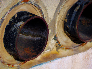
I liked the symmetry and overall balance of this photograph; two circular subjects just a few inches away from each other. However, I tried playing with the angle of the photograph so the subjects wouldn't seem so flat as if I had taken the photo straight on. To bring out more of the rust color, I increased the vibrance and saturation levels in photoshop. 

To me, the stalks of the flowers added much-needed line and movement to the piece--also, it helped to balance out the negative space. The stalks, studded here and there with seed pods and leaves, help to add a sense of symmetry to what would be an otherwise  disorganized composition. 

Wednesday, November 18, 2015

Weekly Photo Post #14

I found the texture of the crumpled aluminum cans, and the plastic bags fascinating. I posterized the photo in order to make the shadows more apparent in the photograph, and to emphasize the diagonal lines crisscrossing throughout. 

I turned the photograph black and white in order to emphasize its tonal range.  The black and white values of the picture range from dark blacks, grays, and light grays; giving the chain link fence a three dimensional quality. 

I purposefully took the photograph with the subject slightly askew in order to make the lines of the picture more interesting than if the subject were parallel to the photo borders. Contrast is the principle I tried to employ; mainly a contrast between the subjects color and shape. The pump is a cherry-red color, whereas the lock is more of an emerald green. 

The cool bluish-white hue of the wall, staircase, and generator work to unify the entire photograph. I found the repetition of vertical lines--in the wall and generator--useful in leading the viewer's eye through the photograph, from left to right. 

The contrast between light and shadow were huge in this photograph, adding to the illusion of depth and three-dimensionality in the photograph. The burnt orange color of fire hydrant blends in with the brownish-red soil to an extent, however the whitish color of the spiderweb helps to distinguish between the background and the foreground. 

Thursday, November 12, 2015

Weekly Photo Post #13

Texture was a large part of this photograph; mainly the texture of the tree bark. I intentionally blurred the branches in the foreground and the leaves in the background in order to emphasize the crisscrossing twigs in the middle ground. 


Shape and contrast were important factors in this piece, for example, the shape of the wood paneling, the windows and the rectangular door frame. And I decided to employ contrast in order to add depth to the overall photograph. 

Pattern and repetition played a large role in the composition of the photo. For instance, the pattern of the rocks and the weeds in the landscaping portion contrasted with the repetition of bricks in the wall of the science building. Because the foreground consists of an untextured concrete wall and the 'no parking' sign, it draws the viewer's eye toward it. 

Line, shape, and color contrast were the fundamental elements of the photograph. Because I saturated the colors so much in photoshop, a distinct transition can be seen between the orange locker and the blue shadows in the final product. Both line and shape help create the illusion of three-dimensions. 

Form and movement were two techniques I attempted to employ in the photograph; by including the repetition of the wooden planks I tried to create a path for the viewer's eye to follow through the photograph. Furthermore, I intentionally unsaturated the photograph in order to emphasize the pattern of the wood grain.  

Wednesday, November 4, 2015

Weekly Photo Post #12

Value was an integral  part of this photograph, in addition to the tonal range captured. For instance, the highlights on the metal rod are very clearly defined, as are the shadows and gray areas. Overall, the lighting of the picture adds a three-dimensional quality to the subject which otherwise would be lacking. 

Even though the subject is static, the repetition of the flowers as well as the leaves incorporate a sense of movement into the photograph. The composition of the picture adds to the overall movement of the piece ; it is unbalanced, with more of the flowers arcing up toward the top right corner than in the opposite direction. 

Perspective was employed in this photograph in order to emphasize the yucca seed pod; the subject was intentionally brought to the foreground, while the rest of the background faded away into a blur. Yet, the radial symmetry of the background (the yucca leaves sprouting out) are both interesting to look at, and they also help to guide the viewer's eye directly to the center of the piece. 

I believe the combination of shapes and lines incorporated in this photo make the architecture appealing to the viewer. The texture of the metal walkways provide definite beginning as well as ending points for the viewer's eye to follow. Furthermore, the stark contrast between color adds depth and dimension to the photo. 

I purposefully offset the subject in order to emphasize the contrast between the circular shape of the lock and the loosely square shapes of the fence links.  However, to unify the photograph, I chose to keep the background simplistic. Furthermore, the color and texture of the lock handle blends nicely with the color and texture of the chain link fence.