
In this photograph, I chose to focus primarily on contrast. First, a contrast between color; the light green of the plant, juxtaposed to the dull orange of the fallen trash can. These complementary colors make the subject pop out more to the viewer. Secondly, I chose to include a contrast of shapes; the rod-like shape of the plant, as opposed to the circular-shaped trash can wheel. I believe the contrast in shape made the photo more visually stimulating.

I explored depth of field in this image; by experimenting with which parts of the photo are in focus, and which are out of focus. By blurring the foreground and making the background clear, I tried to make it seem as though more space existed between the viewer and subject than a mere two-dimensional viewpoint could allow.

Pattern, repetition, and color contrast were the most important principles I employed in this photograph. The repeating pattern of the dark red posts extending into the distance engages the viewer's eye. The background of repeating cinderblock bricks helps to emphasize the posts, making them stand more than they would against a plain background.
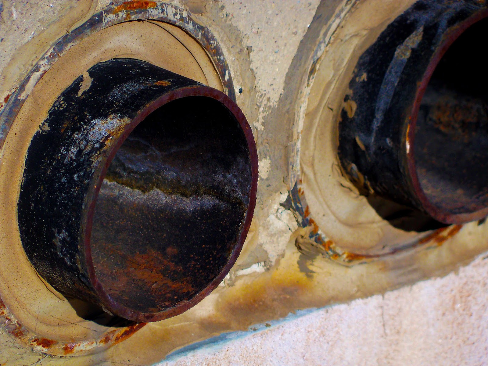
I liked the symmetry and overall balance of this photograph; two circular subjects just a few inches away from each other. However, I tried playing with the angle of the photograph so the subjects wouldn't seem so flat as if I had taken the photo straight on. To bring out more of the rust color, I increased the vibrance and saturation levels in photoshop.

To me, the stalks of the flowers added much-needed line and movement to the piece--also, it helped to balance out the negative space. The stalks, studded here and there with seed pods and leaves, help to add a sense of symmetry to what would be an otherwise disorganized composition.
No comments:
Post a Comment